Kansas City Chiefs Logo History: The Evolution of an Icon
Kansas City Chiefs logo history spans more than six decades and includes three major logo eras. Today’s mark is a white arrowhead outlined in black, with interlocking red “KC” initials at its center — a design that replaced two earlier illustrated logos from the franchise’s Dallas Texans and early Kansas City years.

In short: the Chiefs have used three primary logos since 1960, and the arrowhead introduced in 1972 has become one of the NFL’s longest-running active team logos and one of the most recognized emblems in professional football.
Few NFL team logos survive fifty years without turning into a nostalgia piece — something fans associate with an earlier, dated era of the franchise. The Chiefs emblem did something rarer: it never became outdated in the first place. This piece walks through the full Kansas City Chiefs logo history — from a hand-drawn Texas gunslinger to the interlocking arrowhead fans wear today — and explains the branding logic and logo meaning behind each version, including a few details most “logo database” roundups skip entirely.
Quick Facts: Kansas City Chiefs Logo
A quick reference for anyone researching Kansas City Chiefs branding before diving into the full timeline below.
| Detail | Answer |
|---|---|
| Franchise founded | 1960, as the Dallas Texans |
| Current logo adopted | 1972 |
| Logo concept credited to | Lamar Hunt, franchise founder |
| Refined by | Chiefs design staff, at the time |
| Primary colors | Red (Pantone PMS 186 C) and Gold (Pantone PMS 1235 C) |
| Original logo designer | Bob Taylor (1960 Dallas Texans mark) |
| Home venue since 1972 | GEHA Field at Arrowhead Stadium |
| Number of major redesigns | Two (1963 and 1972) |
Kansas City Chiefs Logo History at a Glance
| Era | Logo | Major Change | Why It Changed |
|---|---|---|---|
| 1960–1962 | Dallas Texans gunslinger | Original franchise identity: a cartoon cowboy over a map of Texas | New AFL expansion team needed a regional visual identity |
| 1963–1971 | Running Native American figure | New city, new name, new artwork | Franchise relocated from Dallas to Kansas City |
| 1972–present | Interlocking “KC” arrowhead | Illustrated figures dropped for a two-color monogram | Lamar Hunt wanted a cleaner, more permanent mark for the franchise’s new stadium era |
Three eras, one franchise, and only one logo redesign that ever really stuck. That logo timeline mirrors a broader sports logo evolution across the NFL during the 1960s and ’70s, when illustrated team mascots gave way to simpler, letter-based marks. Everything below fills in why that happened.
Before the Chiefs: The Dallas Texans Identity (1960–1962)
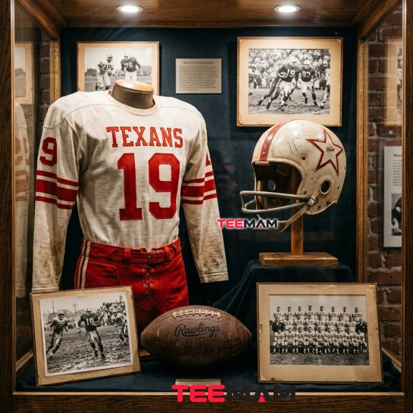
Why Lamar Hunt Founded the Franchise
Oil businessman Lamar Hunt started the team in 1960 as a founding member of the brand-new American Football League, a rival circuit built to challenge the NFL’s hold on professional football. He placed the club in Dallas and named it the Texans, competing directly in a city that already had the NFL’s Dallas Cowboys.
The Original Gunslinger Logo
The first Dallas Texans logo showed a cartoon cowboy — hat, boots, a football tucked under one arm, a pistol in the other — standing in front of a red silhouette of Texas, with the team name stitched across his shirt. It was busy and illustrative, typical of early-1960s sports graphic design, when mascots and characters carried more visual weight than typography or geometric shape.
Bob Taylor’s Role in the Early Visual Identity
Cartoonist Bob Taylor served as the franchise’s first logo designer, creating that original gunslinger mark, and he’d go on to design the franchise’s second logo too, once the team relocated to Missouri. Having the same illustrator carry the identity across that move is part of why the early-1960s logos share a visual DNA despite completely different subject matter.
What the Dallas Texans Logo Represented
The cowboy leaning on a football wasn’t subtle — it was regional pride rendered as literally as possible. That approach was standard for the era. Television broadcasts were still new, and a recognizable illustrated character read better on an early black-and-white screen than an abstract symbol would have, which is why most AFL expansion teams reached for mascots rather than minimalist marks.
Readers interested in the franchise’s broader story beyond the logo itself can also explore our complete Chiefs franchise history, which covers the AFL years, the move to Missouri, and the championship era in more depth.
Why the Team Moved to Kansas City
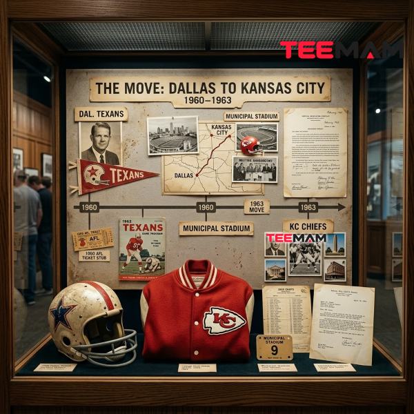
The Relocation That Reshaped the Franchise
Attendance in Dallas struggled, largely because the Texans were competing directly with an established NFL franchise in the same market. Kansas City Mayor H. Roe Bartle saw an opening: the city had no professional football team, and local business leaders pledged enough season-ticket sales to make a move worthwhile. Hunt agreed, and the franchise relocated in 1963.
How the Name “Chiefs” Was Chosen
Here’s a detail casual fans often get wrong: the name “Chiefs” isn’t a direct reference to Native American heritage. It’s a tribute to Mayor Bartle himself, whose nickname was “the Chief,” earned through decades of involvement with a regional Boy Scouts organization. Longtime team executive Jack Steadman suggested the name as a nod to Bartle’s role in bringing the franchise to Missouri, and Hunt approved it.
Why did the Dallas Texans become the Kansas City Chiefs? The franchise relocated from Dallas to Kansas City in 1963 after local leaders, including Mayor H. Roe Bartle, offered incentives the team couldn’t secure in Texas. The new name honored Bartle’s nickname, “the Chief.”
What Changed and What Stayed the Same
The team’s red-and-gold color scheme carried over from Dallas, giving fans some visual continuity even as the mascot, name, and city changed around it. That color consistency across all three logo eras is one of the more overlooked reasons the franchise’s brand identity feels cohesive today, even though the artwork itself was overhauled twice.
The 1963–1971 Logo: Building a New Identity
The Running Native American Illustration
Bob Taylor’s second logo for the franchise depicted a Native American figure in motion, carrying a tomahawk in one hand and a football in the other, set against an outline of six states — Missouri, Kansas, Nebraska, Iowa, Oklahoma, and Arkansas — representing the team’s broader regional fan base beyond Kansas City itself.
Regional Symbolism Behind the Artwork
The six-state map wasn’t decoration. It was a positioning statement: this franchise belonged to the whole Midwest, not just one city. That was a smart move for a league still fighting the NFL for legitimacy and competing for every fan it could draw from a wide geographic footprint.
Why This Version Lasted Less Than a Decade
Illustrated, multi-color logos like this one were difficult to reproduce cleanly at small sizes — on a helmet decal, in a newspaper box score, on a pennant. As the league matured and television coverage expanded through the late 1960s, franchises increasingly favored simpler, bolder marks that read clearly at a distance and reproduced consistently across licensed merchandise. The Chiefs weren’t alone in outgrowing an illustrated origin logo; it was part of a broader shift in professional sports branding at the time, one that eventually pushed most NFL teams away from detailed mascots and toward more geometric, letter-based wordmarks and monograms. <cite index=”57-1″>The NFL had formed NFL Properties in 1963 to serve as the league’s licensing arm</cite>, and as that operation matured through the following decade, simpler team marks were considerably easier for a league-wide licensing business to manage consistently across dozens of product categories than an illustrated figure with fine detail.
The Arrowhead Logo That Changed NFL Branding Forever
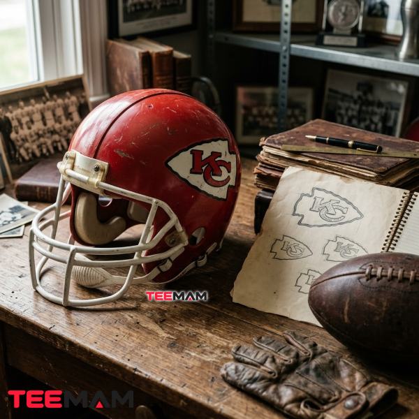
Lamar Hunt’s Famous Napkin Sketch
The story behind the current logo has become something of NFL legend. According to team historians and multiple published accounts of the redesign, Lamar Hunt sketched the concept during a flight back to Kansas City, working out the idea of interlocking “K” and “C” letters inside a bold outer shape.
Inspiration From the San Francisco 49ers
Hunt drew inspiration from the San Francisco 49ers’ helmet mark, which paired an interlocking “SF” inside a simple oval. He liked the clean, letter-based approach but wanted something specific to the Chiefs — so instead of an oval, he sketched the initials inside an arrowhead, a shape that also tied naturally to the franchise’s new home field.
Why the Interlocking KC Works So Well
The arrowhead did double duty as a piece of franchise branding: it preserved a visual nod to the team’s Native American-themed identity without requiring another illustrated figure, and its shape echoed the name of the stadium the team was about to call home. Few redesigns in NFL logo history managed that kind of dual purpose so cleanly, which is part of why this particular Chiefs symbol is so often cited as one of the more thoughtfully built emblems in the league. The venue, which opened the same year as the redesign, has carried the arrowhead name ever since — today known formally as GEHA Field at Arrowhead Stadium following a 2021 naming-rights agreement, though the Chiefs organization has been explicit that “Arrowhead Stadium” remains the core identity of the building itself.
Who designed the Kansas City Chiefs logo? Team founder Lamar Hunt sketched the original concept — an interlocking “KC” inside an arrowhead — inspired by the San Francisco 49ers’ interlocking “SF” logo. Designers on the team’s staff then refined his sketch into the finished mark that debuted in 1972.
For the fuller story of what that arrowhead shape symbolizes and how it ties into the franchise’s regional identity, see story behind the arrowhead symbol.
Why the Design Has Barely Changed Since 1972
Why is the Chiefs logo inside an arrowhead? The arrowhead shape reflects the franchise’s established Native American-themed branding and lines up with the stadium the team moved into that same year, reinforcing a symbol that quickly became inseparable from the organization. It’s also the one piece of the earlier illustrated logos that survived the 1972 redesign intact.
Most write-ups on this topic stop at “it was inspired by the 49ers” and move on. That undersells how much smarter this piece of sports graphic design is than its predecessors. From a branding perspective, nearly every design choice in the arrowhead serves more than one purpose at once: the bold black outline keeps the mark recognizable from the upper deck of a stadium, while the simple two-letter monogram scales cleanly from a helmet decal down to a mobile app icon — something an illustrated cowboy or a detailed running figure could never do without losing detail. Historically, that efficiency became increasingly valuable as televised football and licensed merchandise both expanded through the 1970s: a geometric, high-contrast logo simply translated better to a color broadcast, a scoreboard graphic, or a two-color print run on a cap than a busy illustration ever could. It also happened to be far cheaper to license and reproduce, which matters enormously once apparel and collectibles become a real revenue stream for a franchise rather than a side business. Historical logo archives such as SportsLogos.net still list the 1972 mark as the franchise’s only primary logo change since the merger era, underscoring just how rare this level of consistency is across the league. Functionally, the arrowhead now serves as both the club’s primary trademark and its helmet logo — a dual role most NFL emblems have had to redesign their way into rather than land on by 1972.
Looking back at every redesign in Kansas City Chiefs logo history, it’s hard not to notice the same trend: each version simplified the visual identity while strengthening long-term recognition, turning what started as a regional football logo into one of the more iconic NFL logos still in use today.
Breaking Down the Logo Design
| Design Element | Meaning | Why It Works |
|---|---|---|
| Arrowhead outline | Native American heritage reference, tied to the team’s stadium name | Bold, high-contrast shape reads clearly at any size |
| Interlocking “KC” | Kansas City initials | Compact monogram avoids the need for a full wordmark |
| Red (PMS 186 C) | Carried over from the original Dallas Texans color scheme | Reinforces continuity across all three logo eras |
| Gold (PMS 1235 C) | Secondary color from the franchise’s founding palette | Adds contrast without competing with the primary red |
| Black outline | Frames the arrowhead and separates it from any background | Keeps the mark legible on light or dark surfaces alike |
As a helmet logo, this combination of shape and color has to work under stadium lights, on television, and printed small on a jersey sleeve — and the fact that the same team logo still holds up in all three contexts more than fifty years later says a lot about how well it was built. Few case studies in football logo history make that point as clearly as the arrowhead does.
Color played a bigger role in this story than most fans realize. Hunt originally wanted orange and Columbia blue for the Dallas Texans, but the Houston Oilers claimed that combination first, pushing him toward red and gold instead. Decades later, those same colors — <cite index=”27-1″>officially Pantone PMS 186 C for red and PMS 1235 C for gold</cite> — became the foundation of one of the more durable brand identities in the NFL, precisely because they had a decade of history behind them by the time the arrowhead debuted.
Longevity wasn’t an accident, either. The Chiefs mark uses exactly two colors and two letterforms as its vector logo. There’s no gradient, no drop shadow, no secondary mascot competing for attention. That restraint is a big part of why it has survived helmet redesigns, uniform overhauls, and five decades of shifting sports-branding trends without ever needing a true refresh — a rare thing in an industry where brand licensing revenue often depends on giving fans a “new” logo to buy into every few years.
Old Chiefs Logos vs. Today’s Logo
| Feature | Early Logos (1960–1971) | Modern Arrowhead (1972–present) |
|---|---|---|
| Complexity | Multi-color illustrated figures | Two-color geometric monogram |
| Readability at distance | Weak — fine detail gets lost | Strong — bold shapes and letterforms |
| TV visibility | Poor on early broadcasts | Built for the color-TV era |
| Merchandise and licensing appeal | Limited by production cost | Cheap and consistent to reproduce |
| Digital adaptability | Difficult to scale cleanly | Works from favicon to stadium signage |
What is the difference between the old Chiefs logo and today’s logo? The 1960–1971 logos used detailed illustrated figures — first a cowboy, then a running Native American — set against colorful backgrounds. The 1972 arrowhead logo replaced both with a simple two-color monogram, trading illustrated detail for legibility and long-term brand consistency.
Why the Chiefs Have Never Needed a Major Rebrand

Fans rarely think consciously about brand consistency while watching a game, but they notice it instinctively. Seeing the same arrowhead their parents and grandparents cheered for creates a sense of continuity that few NFL franchises can match, and that emotional throughline has only gotten stronger since 2020. <cite index=”41-1″>The Chiefs have won four Super Bowls: IV in 1970, LIV in 2020, LVII in 2023, and LVIII in 2024</cite>, with a run of AFC Championships that turned the arrowhead into more than a historical artifact — it’s now a symbol with real championship equity attached to it.
Compare that to franchises like the Buccaneers or Broncos, which have cycled through full redesigns chasing a more modern look, only to circle back toward their older, more recognizable identities once fans pushed back. The Chiefs never had to make that round trip, largely because the 1972 mark was built with enough visual restraint to age well in the first place — a case study in Chiefs branding discipline that a lot of other NFL emblems could learn from.
That kind of stability puts the Chiefs in a small club. The Green Bay Packers’ “G” and the Pittsburgh Steelers’ hypocycloid have gone essentially untouched since the 1960s, and the Raiders’ shield has barely shifted since 1963 — but most of the league has redesigned at least once, often more than that, since the merger era. What separates the Chiefs from that short list is timing: Green Bay, Pittsburgh, and Las Vegas locked in their marks early and never revisited them, while Kansas City actually went through two earlier redesigns before landing on the arrowhead in 1972. Getting it right on the third attempt, and then holding the line for over fifty years afterward, is arguably the more interesting branding story of the group.
How the Arrowhead Became Part of Chiefs Kingdom Culture
Walk through the parking lots outside GEHA Field a few hours before kickoff and one detail stands out fast: the merchandise on display spans decades, not just one season. Brand-new jerseys sit next to faded 1990s crewnecks, throwback jackets passed down within families, and ballcaps worn thin at the brim — and nearly all of it features the exact same arrowhead. Fans in their sixties wear the same mark as fans who weren’t born the last time the Chiefs won a Super Bowl before 2020. Few NFL logos blend that many generations of gear so seamlessly, and it isn’t an accident: it’s a direct byproduct of a single 1972 design decision holding up for more than fifty years without a meaningful update.
How Historic Logos Drive Modern Vintage Fan Gear

Vintage aesthetics never really left NFL fan fashion — if anything, they’ve become more visible as fans lean into nostalgia alongside current-season gear. The longevity of the 1972 arrowhead is exactly why classic, throwback looks still dominate Chiefs game-day style. Instead of chasing whatever graphic-design trend is current, Chiefs Kingdom fans consistently gravitate toward heritage-driven pieces that nod to the franchise’s full visual history — from the Dallas Texans years through the championship era at GEHA Field at Arrowhead Stadium. Distressed prints of older logo eras, washed cotton built around mid-century typography, and classic red-and-gold colorways show up constantly on tailgate lots, precisely because they connect current fans to decades of team history rather than just the current season.
At TeeMam, we enjoy tracing those older design chapters as much as the current one — there’s more story in a franchise’s visual history than most current-season merchandise ever shows. If you’re building a game-day outfit around the team’s visual evolution, our guide to classic Chiefs game day styles breaks down how the uniforms changed alongside the logo. Readers interested in modern interpretations of that same identity can explore our official inspired fan apparel.
Why the Chiefs Logo Has Become a Holiday Gift Favorite

A logo this recognizable translates naturally into gifting. Collectibles, apparel, and home décor built around the arrowhead work across three or four generations of the same family, which is rare for any brand mark, sports or otherwise. Personalized gear — a jersey with a family member’s name, an ornament, a throw blanket — tends to hold up better as a gift than generic team merchandise, precisely because the logo itself already carries so much shared history.
If you’re shopping for a Chiefs fan this season, our holiday gifts for Chiefs fans guide breaks down options by budget and by which era of the team’s visual history they lean into.
Common Questions About Kansas City Chiefs Logo History
These are the questions that come up most often when fans look into Kansas City Chiefs logo history, the team’s logo meaning, and how the current emblem came together.
Who designed the Kansas City Chiefs logo?
Lamar Hunt sketched the original concept on a napkin, inspired by the San Francisco 49ers’ interlocking “SF” mark. Cartoonist Bob Taylor designed both of the franchise’s earlier logos, in Dallas and in the team’s first years in Kansas City.
Why is the logo inside an arrowhead?
The arrowhead shape connects to the franchise’s home stadium, which opened the same year the logo debuted, in 1972, and it’s the one remaining piece of Native American-themed imagery carried over from the franchise’s earlier branding.
Has the Chiefs logo ever been redesigned?
Yes, twice before landing on the current mark: the original 1960 Dallas Texans gunslinger, followed by the 1963 running Native American figure used through 1971. The arrowhead debuted in 1972 and hasn’t been redesigned since, aside from minor technical refinements.
What was the Dallas Texans logo?
A cartoon cowboy holding a football, set against a red silhouette of Texas, designed by cartoonist Bob Taylor for the franchise’s original 1960 identity in Dallas.
Why has the logo remained almost unchanged?
Its simplicity is the main reason. A two-color, two-letter geometric mark doesn’t age the way an illustrated figure does, so there’s been little commercial or cultural pressure to redesign it the way more detailed or dated-looking sports logos eventually require.
Is the current logo different from the 1972 version?
Only in minor technical refinements — small adjustments to line weight and proportions over the decades to keep the vector logo consistent across digital and print use. The core design, letterforms, shape, and colors have stayed the same since 1972.
Final Thoughts
Kansas City Chiefs logo history ultimately tells a story about restraint rather than reinvention: three logos in over sixty years is a remarkably short list for an NFL franchise, especially one that’s spent the last several seasons as one of the league’s most visible brands. From a hand-drawn Texas cowboy to a running Native American figure to the interlocking arrowhead now stitched onto everything from helmets to holiday sweaters, the Kansas City Chiefs’ visual identity shows how a carefully designed emblem can stay relevant across generations of fans instead of chasing every design trend that comes along. That’s rarer in professional sports branding than most fans realize, and it’s a big part of why the arrowhead means as much to a longtime season-ticket holder as it does to someone who only discovered the team during its recent championship run. The logo isn’t just a piece of graphic design — it’s a thread connecting more than five decades of fans to the same colors, the same shape, and the same team.
Sources: Logo and franchise-relocation history reflect published team-branding archives, sports-logo historical references, and contemporaneous local news coverage of the 1963 relocation and 1972 redesign. The NFL Properties founding date is drawn from the Pro Football Hall of Fame’s league history archive. Color specifications reflect the Pantone Color Institute’s published PMS 186 C (red) and PMS 1235 C (gold) codes for the franchise. Stadium-naming details reflect the Chiefs’ and GEHA’s March 2021 joint announcement of the GEHA Field at Arrowhead Stadium naming-rights agreement. Super Bowl results reflect the NFL’s official postseason record for the franchise as reported by major sports outlets.

Hi, I’m Olivia Bennett, a fashion and lifestyle writer at TeeMam with 6 years of experience creating content about fashion, outfits, and lifestyle trends. I enjoy sharing practical style ideas for everyday wear, game days, holidays, and special occasions, helping readers find looks that feel comfortable, fun, and uniquely their own.