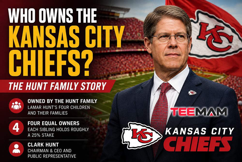
The Meaning Behind the Kansas City Chiefs Arrowhead Logo
Stand outside GEHA Field at Arrowhead Stadium two hours before kickoff and you’ll spot the same shape everywhere: stitched onto jerseys, spray-painted on tailgate coolers, inked permanently on forearms, taped to truck windows three states away from Missouri. The Kansas City Chiefs Arrowhead logo has done something very few sports marks manage. It’s stayed almost exactly the same since 1972, and it hasn’t gotten stale once.
Logos usually evolve because a team wants a fresh look or a new merchandise cycle. The Chiefs never really needed either. Lamar Hunt’s original concept was clear enough, and simple enough, that the franchise spent the next five decades protecting it instead of reinventing it. Here’s where that shape actually came from, what each piece of it is doing, and why it still reads the same way more than fifty years later.
Quick Facts: The Chiefs Arrowhead Logo
| Detail | Information |
|---|---|
| First appeared on helmets | 1963 |
| Current primary logo since | 1972 |
| Concept sketched by | Lamar Hunt (team founder) |
| Design inspiration | San Francisco 49ers’ interlocking “SF” oval |
| Colors | Red, gold, black, white |
| Franchise founded as | Dallas Texans (1959) |
| Home venue | GEHA Field at Arrowhead Stadium (opened 1972) |
| Super Bowl championships | 4: Super Bowl IV (1969 season), LIV (2019 season), LVII (2022 season), LVIII (2023 season) |
What Does the Kansas City Chiefs Arrowhead Logo Mean?

The Kansas City Chiefs Arrowhead logo is an interlocking red “KC” set inside a white arrowhead outlined in black. The arrowhead shape references the team’s Chiefs name and Arrowhead Stadium, while the interlocking letters form a compact, instantly readable monogram inspired by the San Francisco 49ers’ interlocking “SF.”
The shape is doing double duty. It nods to the franchise’s naming history and its Great Plains home, and it solves a practical design problem: a pointed silhouette reads faster at a distance than a circle or an oval, which matters when the logo has to be recognized on a moving helmet from the cheap seats. The “K” and “C” don’t sit side by side, either. They share strokes, locking together the way initials do on a monogrammed ring, which keeps the whole mark legible whether it’s the size of a lapel pin or painted across a parking lot.
In short, the Kansas City Chiefs Arrowhead logo works because it pairs regional symbolism with a shape built to be read at a glance.
Key takeaways:
- The arrowhead ties directly to the Chiefs name and to Arrowhead Stadium itself
- The interlocking “KC” letters were hand-drawn by Lamar Hunt, not pulled from a typeface
- The pointed shape was chosen partly for practical visibility, not just symbolism
From the Dallas Texans to the Chiefs: The Story Before the Arrowhead
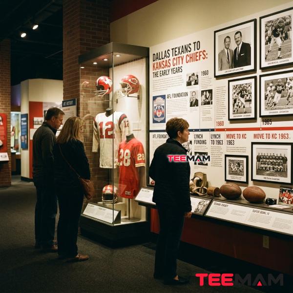
Before there was an arrowhead, there was a cowboy with a gun.
Lamar Hunt founded the franchise in 1959 as the Dallas Texans, one of eight original teams in the newly formed American Football League. Cartoonist Bob Taylor drew the first logo: a Texas cowboy planted in front of a red map of the state, boots on, football tucked under one arm, “Texans” splashed across his chest. It was busy and illustrative, closer to a comic strip panel than a modern sports mark.
Dallas already had the Cowboys competing for the same fans, and the Texans struggled to draw a crowd. In 1963, Hunt moved the team to Kansas City, Missouri. General manager Jack Steadman talked him out of keeping the Texans name, and after kicking around options including the Mules, the Royals, and the Stars, the franchise settled on the Chiefs, a nod to Kansas City’s mayor at the time, Harold Roe Bartle, who’d earned the nickname “The Chief” during his decades running the Boy Scouts. Taylor came back to design a new mark: a Native American figure striding across an outline of Missouri, used as the team’s official logo from 1963 through 1971, right through the franchise’s move into the AFL-NFL merger.
That transitional identity is the piece of Chiefs history most fans skip past entirely, and it’s the missing link between the cowboy and the arrowhead everyone knows today. The full early Chiefs franchise story covers the relocation, the naming fight, and everything else that happened before Hunt ever picked up a pen on that flight home.
In short, the arrowhead was actually the franchise’s third logo, not its first, arriving only after a cowboy and a Missouri map came and went.
Key takeaways:
- The franchise started as the Dallas Texans in 1959, with a cowboy logo
- The Chiefs name honors Kansas City mayor Harold Roe Bartle, nicknamed “The Chief”
- A Native American-and-Missouri-map logo, not the arrowhead, was the official mark from 1963 to 1971
How Lamar Hunt Created One of the NFL’s Most Recognizable Logos

You don’t need a Madison Avenue design firm to build a logo that outlasts fifty years of NFL rebrands. Sometimes a napkin and a flight home does the job better.
Lamar Hunt sketched the interlocking “KC” concept himself, reportedly on a napkin during a flight back to Kansas City, after noticing how the San Francisco 49ers’ helmet logo used an interlocking “SF” inside an oval. Rather than copy the oval outright, Hunt swapped it for a shape that pointed straight back to the team’s own identity: an arrowhead. According to SportsLogos.Net’s history of the design, the interlocking “KC” first showed up on Chiefs helmets in 1963, the same year the team landed in Kansas City, but it stayed a helmet-only detail for nearly a decade while the Native American-and-Missouri logo remained the official mark.
Timing mattered here. By 1970, the AFL and NFL had fully merged into one league, and Hunt, one of the AFL’s founding architects, had every reason to want a logo that read as major-league rather than regional upstart. The arrowhead became the franchise’s official primary identity in 1972, the exact year GEHA Field at Arrowhead Stadium opened its gates, giving the team a matched pair: a building and a mark that reinforced each other on sight.
Uniform colors almost ended up looking completely different. Hunt originally wanted orange and Columbia blue for the team, but the Houston Oilers claimed that combination first, which pushed Kansas City toward the red and gold that now defines Chiefs Kingdom from head to toe. Two years before the arrowhead became official, Hank Stram, the only man to coach the franchise through its entire American Football League run and later its early seasons in the American Football Conference, delivered a Super Bowl IV win over the Minnesota Vikings while famously coaching his players to “just keep matriculatin’ the ball down the field, boys,” a line NFL Films turned into one of the most replayed sound bites in football history. According to the Kansas City Chiefs’ own team history, Hunt’s influence on the league went well beyond one logo, but that Super Bowl IV win gave the franchise, and the identity it was about to lock in, real national weight heading into the 1972 redesign.
In short, the colors and the coaching success arrived first, and the logo that carries them didn’t become official until both were already in place.
Key takeaways:
- Hunt hand-sketched the concept, inspired by the 49ers’ interlocking “SF” oval
- The arrowhead lived on Chiefs helmets from 1963 but wasn’t the official logo until 1972
- Red and gold became the team’s colors only after Houston claimed Hunt’s first choice
Breaking Down Every Design Element of the Arrowhead Logo
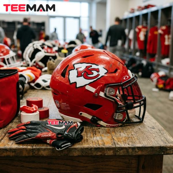
Why an Arrowhead?
Arrowheads carry real weight as symbols of the Great Plains, precision, and forward motion, all of which line up neatly with a football team named the Chiefs. The pointed shape also just moves better visually than a circle or shield would. It reads as directional, almost like it’s driving toward the end zone, which gives the mark a sense of momentum a rounder silhouette could never fake.
The Interlocking KC Letters
The lettering inside the arrowhead isn’t a stock typeface pulled from a catalog. Hunt’s original hand-drawn letterforms are still what the team uses today, which is a big part of why the logo feels handmade instead of corporate even after sixty-plus years in circulation. The “K” and “C” interlock rather than sit side by side, reading as one unified mark instead of two separate initials, reinforcing “Kansas City” as a single identity rather than a city name bolted onto a generic team shape.
Why Red, Gold and Black Were Chosen
Red carries the palette, and that’s not subtle by design. In sports branding, red consistently signals intensity and energy, which is exactly why it shows up across so many NFL identities. Gold adds warmth and a sense of prestige without competing with the red for attention. The thick black outline handles the unglamorous but essential job of making the whole mark pop against any background, from a snowy Missouri sideline to a bright television broadcast, while white fills the arrowhead itself to keep the shape legible at a glance.
Why the Logo Has Barely Changed in More Than 60 Years
Outside of a slight thickening of the black border in the mid-1970s, the Kansas City Chiefs Arrowhead logo you see today is essentially the same mark that became official in 1972. That kind of consistency is rare in pro sports, where franchises routinely refresh logos every decade to move new merchandise. For the Chiefs, the arrowhead has become brand equity in the truest sense: swapping it out would mean throwing away decades of built-in recognition for the sake of a trend.
If you want to see every era side by side, from the cowboy to the Missouri map to the modern arrowhead, the complete logo evolution guide lays out each version in order, with the design details that changed between them.
| Era | Years Used | Description |
|---|---|---|
| Dallas Texans cowboy | 1960–1962 | Cowboy holding a football, Texas map background |
| Native American / Missouri map | 1963–1971 | Native American figure on a Missouri outline; the franchise’s official primary logo |
| Interlocking KC on helmet | 1963–1971 | Arrowhead-and-KC design used on helmets only, not yet the primary mark |
| Kansas City Chiefs Arrowhead logo | 1972–present | Interlocking red “KC” inside a white, black-bordered arrowhead; became the primary logo |
In short, the arrowhead succeeded because it combined regional symbolism with a level of simplicity that never needed a redesign.
Key takeaways:
- The arrowhead’s point gives it a sense of motion other shapes don’t have
- Hunt’s hand-drawn letterforms are still in use, unchanged from the original sketch
- The design has needed only one minor adjustment, a thicker border, since 1972
Why the Arrowhead Logo Became Bigger Than a Football Symbol

The logo probably wouldn’t carry the same emotional weight without decades of winning behind it. The Chiefs have claimed four Super Bowl championships behind that arrowhead, Super Bowl IV after the 1969 season, LIV after 2019, LVII after 2022, and LVIII after 2023, and the run under Patrick Mahomes turned “Chiefs Kingdom” from a fan nickname into a genuine cultural label. There’s a fitting bit of trivia buried in that history too: Lamar Hunt is credited with coining the term “Super Bowl” itself, so the franchise’s fingerprints are on the very name of the game it now dominates.
Sustained TV exposure does the rest of the work. Once a logo shows up on national broadcasts dozens of times a season for years running, it stops registering as “a team’s branding” and starts working like a shared visual shorthand, something people recognize the same instant way they’d recognize a stop sign. That’s the difference between a logo people wear because their team happens to play in it and a logo people ink onto their skin.
Not every NFL mark earns that. The Cleveland Browns famously skip a helmet logo altogether, and the Chicago Bears lean on a plain “C.” Both work fine as branding, but neither carries the same layered history: a napkin sketch, a stadium name, a fifty-year win drought followed by a modern dynasty. This arrowhead carries all of that weight in one small shape, which is exactly why it shows up on tailgate flags and painted coolers as often as it does on official merchandise.
In short, four championships and decades of broadcast exposure turned a helmet decal into a piece of regional identity fans carry well past game day.
Key takeaways:
- Four Super Bowl championships turned the arrowhead into a symbol of sustained success, not just a helmet decal
- Lamar Hunt is credited with coining the term “Super Bowl”
- Decades of national broadcast exposure turned the mark into instant visual shorthand
How the Arrowhead Logo Influences Modern Fan Apparel

Walk any tailgate lot before a home game and you’ll see the arrowhead reworked a dozen different ways: oversized vintage prints that lean into the hand-drawn feel of the original 1972 letterforms, stripped-down single-color versions built for streetwear, distressed graphics designed to look decades older than they actually are. That range only works because the underlying shape is simple enough to survive almost any treatment without losing what makes it recognizable.
That’s really the appeal. The arrowhead doesn’t need a modern reboot to look good on a hoodie, which is why the best Chiefs gear tends to lean into that rugged, old-school look instead of overcomplicating a shape that already does the job. If you’re interested in seeing how designers reinterpret the logo across modern apparel, from heavyweight vintage-wash tees with a distressed arrowhead print to cleaner fits built for the tailgate lot, the official Chiefs fan apparel lineup covers that full range.
In short, the arrowhead’s simplicity is exactly what lets it survive so many different apparel styles without ever looking out of place.
Key takeaways:
- The logo’s simple geometry survives vintage, minimalist, and streetwear treatments equally well
- Apparel trends lean into the arrowhead’s age rather than trying to modernize it
- Fit and print style vary more than the logo itself, which stays consistent across every version
Why the Arrowhead Stadium Name Complements the Team Logo

It’s not a coincidence that the Chiefs play under an arrowhead and wear one on their helmets. The stadium, now officially GEHA Field at Arrowhead Stadium under a naming-rights deal signed in 2021, opened in 1972, the exact same year the arrowhead became the franchise’s official logo. When the Chiefs announced the GEHA partnership, team president Mark Donovan made a point of noting the deal reflected “respect for Chiefs Kingdom,” language that underlines how tightly the organization guards the connection between the stadium’s identity and its logo, even while selling naming rights to the field itself.
Fans don’t consciously separate the stadium from the logo anymore. Seeing one naturally calls the other to mind, which is the kind of brand reinforcement most sports franchises spend decades chasing and never fully land. For anyone planning an actual trip to a game, that shared history adds real context before you even reach the gates. The Arrowhead Stadium visitor guide covers seating, capacity, and what first-time visitors should expect walking in.
In short, the stadium and the logo were built to reinforce each other from day one, and fifty years later that pairing still does its job.
Key takeaways:
- Arrowhead Stadium opened the same year, 1972, that the arrowhead logo became official
- GEHA holds naming rights to the field only; the Chiefs kept “Arrowhead” in the venue’s name on purpose
- The stadium and logo reinforce each other so strongly that fans rarely think of them separately
Common Questions About the Kansas City Chiefs Arrowhead Logo

Why is the Chiefs logo shaped like an arrowhead?
The shape ties back to the team’s Chiefs name and to Arrowhead Stadium itself. Lamar Hunt chose it over a standard oval or circle because it referenced the team’s identity more directly while still framing the interlocking “KC” letters cleanly.
Who designed the Chiefs logo?
Team founder Lamar Hunt sketched the original interlocking “KC” concept, reportedly on a napkin, drawing on the San Francisco 49ers’ interlocking “SF” oval logo for inspiration. The earlier Dallas Texans and Missouri-map Chiefs logos were designed by cartoonist Bob Taylor.
Has the Chiefs logo ever changed?
Yes, three times before landing on the current design. The franchise used a cowboy logo as the Dallas Texans from 1960 to 1962, then a Native American figure on a Missouri map as the Kansas City Chiefs from 1963 to 1971. The interlocking arrowhead appeared on helmets starting in 1963 but didn’t become the official primary logo until 1972.
What did the Chiefs logo look like before the arrowhead?
Before the arrowhead became the primary mark, the Chiefs’ official logo showed a Native American man walking across an outline of the state of Missouri, used from 1963 through 1971.
Is the Arrowhead logo connected to Arrowhead Stadium?
Yes. Both share the same arrowhead symbolism, and both arrived the same year. Arrowhead Stadium, now GEHA Field at Arrowhead Stadium, opened in 1972, the same year the interlocking KC arrowhead officially became the team’s primary logo.
Why has the logo stayed almost unchanged for decades?
Consistency builds recognition, and the organization has treated the Kansas City Chiefs Arrowhead logo as a long-term brand asset rather than something to refresh for merchandise cycles. Outside of a minor border adjustment in the 1970s, the core 1972 design remains intact today.
Conclusion
The Kansas City Chiefs Arrowhead logo works because it never tried to do too much. A napkin sketch from a team founder. A shape borrowed in spirit from a rival franchise’s helmet. Letters drawn by hand instead of pulled from a type catalog. Put those pieces together and you get one of the most recognized marks in American sports, one that survived a franchise relocation, three earlier logo attempts, and more than five decades of NFL rebrands without losing its shape. Knowing where it came from doesn’t just make for good tailgate trivia. It changes how you see the mark itself: not decoration, but a genuine piece of football history still riding on every helmet in Kansas City red.
Source note: Historical design details in this article draw on published logo histories from SportsLogos.Net, official franchise history from the Kansas City Chiefs, and the Pro Football Hall of Fame.

Hi, I’m Olivia Bennett, a fashion and lifestyle writer at TeeMam with 6 years of experience creating content about fashion, outfits, and lifestyle trends. I enjoy sharing practical style ideas for everyday wear, game days, holidays, and special occasions, helping readers find looks that feel comfortable, fun, and uniquely their own.