San Francisco 49ers Logo Evolution: History, Colors & Meaning (1946 to Present)
Walk into any sports bar during a Niners game and you’ll spot at least three different eras of the logo in the room — a faded prospector tee from someone’s dad, a scarlet SF hoodie from the Montana years, and a brand-new fitted cap with the current mark. That’s rare in the NFL. Most franchises have torn up their identity at least once for a “modern rebrand.” The 49ers haven’t, not really, and that consistency is exactly why the logo’s evolution is worth understanding in detail.
The short version: the San Francisco 49ers logo has moved through four distinct eras since the franchise’s founding in 1946 — a hand-illustrated Gold Rush prospector (1946–1967), the now-legendary interlocking “SF” monogram (1968–1995), a sharpened, more contrast-heavy version of that same monogram (1996–2008), and the brighter, digitally-optimized mark the team wears today (2009–present). Across all four versions, one thing never moved: the scarlet-and-gold color identity tied directly to the 1849 California Gold Rush. Every redesign refined the visual identity. None of them touched the meaning.
San Francisco 49ers Logo at a Glance
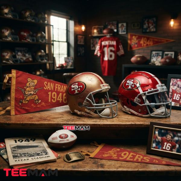
| Detail | Info |
|---|---|
| Franchise founded | 1946 (All-America Football Conference) |
| Joined the NFL | 1950, after the AAFC folded |
| First logo | Gold Rush prospector, 1946–1967 |
| Current logo | Interlocking “SF” monogram, in use since 2009 |
| Total primary logo redesigns | 4 |
| Official colors | Scarlet red and metallic gold |
| Home venues | Kezar Stadium → Candlestick Park → Levi’s Stadium |
| Super Bowl titles | 5 (XVI, XIX, XXIII, XXIV, XXIX) |
Key facts:
- The current logo has been in continuous use since 2009, with only the 1996 and 2009 refreshes altering the original 1968 design.
- The interlocking “SF” monogram first appeared in 1968, replacing the illustrated prospector.
- The original 1946 logo featured an armed Gold Rush prospector rather than any lettering at all.
- SportsLogos.net’s fan-rated logo database consistently ranks the 1946–1967 prospector among the franchise’s highest-rated primary logos, often on par with the current design.
What Is the Current San Francisco 49ers Logo?
The current San Francisco 49ers logo is the interlocking “SF” monogram introduced in 2009. It features white letters set inside a scarlet oval with metallic gold trim, continuing the same basic design language the franchise first introduced in 1968, refined for sharper contrast on digital and broadcast platforms.
Why Are the 49ers Named After the Gold Rush?
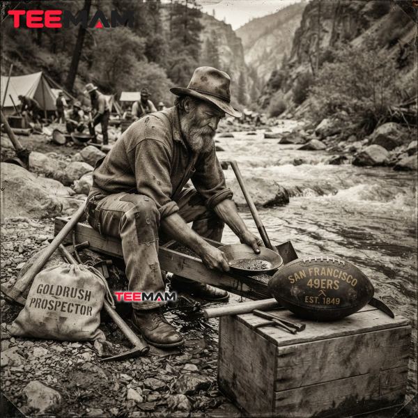
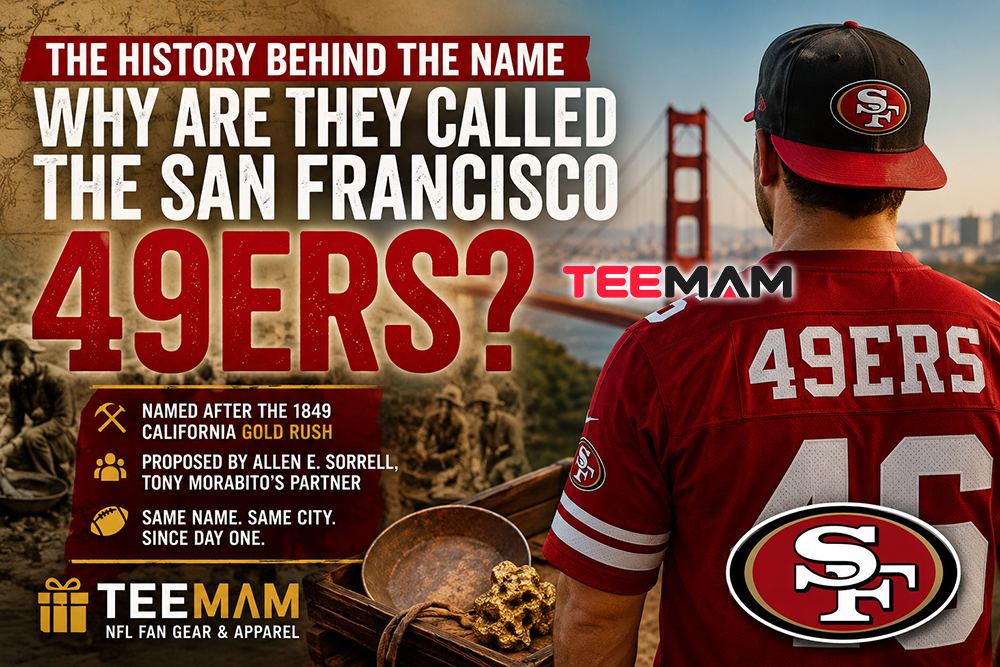
The name has nothing to do with football and everything to do with 1849. That year, tens of thousands of prospectors — nicknamed “forty-niners” — poured into Northern California chasing gold after it was discovered at Sutter’s Mill. San Francisco went from a sleepy port town to a boomtown almost overnight, and the Gold Rush became the defining event in the region’s early identity.
When Anthony J. Morabito and Allen Sorrell founded the franchise in 1946 as a charter member of the All-America Football Conference (AAFC) — the same upstart league that gave rise to the Cleveland Browns under Paul Brown — they wanted a name that was unmistakably tied to the city’s own origin story rather than a generic mascot. “Forty Niners” did that instantly — it told people exactly where the team was from and what that place was built on. When the AAFC folded after the 1949 season, the 49ers joined the National Football League (NFL) in 1950 alongside the Browns and the original Baltimore Colts. The franchise is still legally registered today as the San Francisco Forty Niners. If you want the fuller backstory on the name itself, including how the franchise settled on it over other proposals, why the team is called the 49ers covers that in more depth.
Timeline of the San Francisco 49ers Logo Evolution
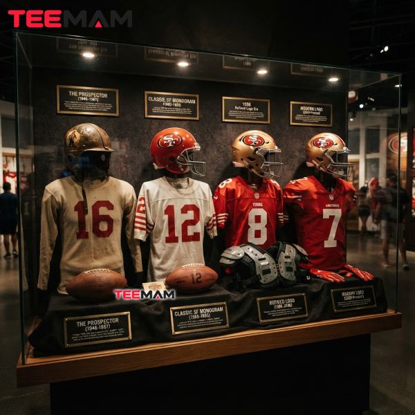
The San Francisco 49ers logo has changed four times since the franchise was founded in 1946. Below is the complete timeline, era by era.
1946 — Illustrated Gold Rush prospector debuts
   ↓
1968 — Interlocking "SF" monogram replaces the prospector
   ↓
1996 — Monogram sharpened with heavier outlines and gold trim
   ↓
2009 — Brighter, simplified version introduced (current logo)
Looking at the 49ers logo history era by era makes the pattern obvious: each redesign responded to a real shift — in broadcasting technology, in NFL merchandising standards, in how the franchise wanted to present its brand identity — rather than change for its own sake, from the original prospector logo all the way to today’s SF helmet emblem.
1946 to 1967: The Original Pistol-Shooting Prospector
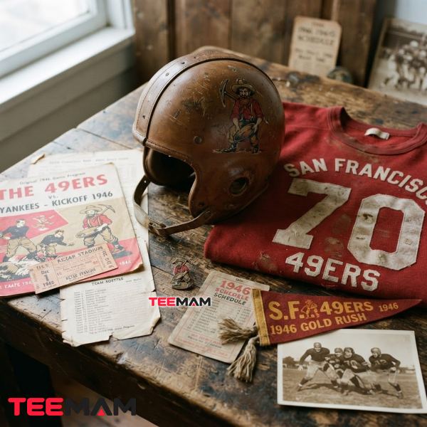
The very first 49ers logo was chaotic by design. It showed a mustached, plaid-clad gold miner mid-air, hat flying off, firing a pistol in each hand — one shot nearly clipping his own boot, the other’s smoke curling into the shape of the words “Forty-Niners.” By the mid-1950s, the illustration was updated to place the prospector jumping in front of Kezar Stadium, the team’s home from 1946 to 1970.
It’s a busy, almost cartoonish piece of design, and that’s exactly the point. It captured the reckless, get-rich-quick energy of the Gold Rush rather than trying to look dignified. Today it’s arguably the most collected version of the logo among vintage-jersey hunters — SportsLogos.net’s community rankings have consistently shown strong fan appreciation for the original prospector design, often rating it on par with or ahead of the current mark. It shows up constantly on throwback helmets and retro apparel drops precisely because it looks like nothing else in the league, then or now.
1968 to 1995: The Birth of the Famous SF Monogram
In 1968, the franchise dropped the illustrated prospector entirely in favor of something built for television: a red oval with an interlocking, hand-drawn “SF” monogram outlined in gold, with the letters themselves rendered in white. The typography was custom — long, antique-style serifs on the S and F — which gave the mark a sense of permanence that the earlier cartoon logo never had. Oddly, no individual designer or agency was ever publicly credited for it, which was common practice for team branding at the time.
This is the logo most fans associate with the franchise’s golden era. It was on the helmet for every Super Bowl win under Bill Walsh and Joe Montana in the 1980s — Super Bowl XVI, XIX, XXIII, and XXIV — and for the Steve Young-led Super Bowl XXIX championship in 1995, five Super Bowl titles in total. The team played its home games at Candlestick Park throughout this stretch, after moving there from Kezar Stadium in 1971. That run is a big reason the monogram carries so much weight with fans who never saw the prospector version at all: the logo became inseparable from the most successful stretch in team history, and with it, a lot of the franchise’s rivalry history with teams like the Dallas Cowboys and the Los Angeles Rams took shape.
| Championship | Season | Logo Era Worn |
|---|---|---|
| Super Bowl XVI | 1981 | 1968–1995 Classic SF Monogram |
| Super Bowl XIX | 1984 | 1968–1995 Classic SF Monogram |
| Super Bowl XXIII | 1988 | 1968–1995 Classic SF Monogram |
| Super Bowl XXIV | 1989 | 1968–1995 Classic SF Monogram |
| Super Bowl XXIX | 1994 | 1968–1995 Classic SF Monogram |
1996 to 2008: Sharper Lines and Gold Trim
The core monogram didn’t change in 1996 so much as it got refined. Outlines were thickened, the black accenting around the lettering became more deliberate, and the gold border was made more consistent across uniforms, helmets and licensed merchandise. None of this was cosmetic vanity — it was a response to how inconsistently the previous version had been reproduced across different manufacturers and media. A cleaner, more standardized mark held up better on high-definition broadcasts and printed far more reliably on jerseys, banners, and retail gear alike.
2009 to Present: Returning to a Timeless Classic
The current logo, introduced in 2009, brightened the scarlet, simplified the linework, and pulled back some of the heavier detailing from the 1996 version. It reads as a return to the cleaner spirit of the original 1968 monogram rather than a fresh idea. That’s a deliberate and increasingly common move across sports branding generally — logos built decades ago for helmets and print now have to work at the size of an app icon, a social media profile image, or a jersey patch shrunk down on a phone screen. Flatter, higher-contrast marks simply survive that shrinking process better than heavily detailed ones, which is a big part of why the 2009 refresh has stuck around with almost no changes for over fifteen years.
How the 49ers Team Colors Have Changed Over Time
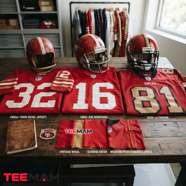
The palette has always been scarlet, gold, black and white — what’s shifted is emphasis and saturation, not the core identity.
Scarlet
Scarlet has represented the franchise since its earliest uniforms in 1946, but its role goes beyond tradition. Multiple color-reference sources list the 49ers’ official red as Pantone PMS 187 C (hex #AA0000) — a deep, saturated shade rather than the brighter “fire engine” red some other NFL teams use. That depth of tone reads well under stadium lighting and holds contrast on broadcast cameras, which is likely why it’s the one element every redesign since 1946 has kept in place.
Gold
Gold is the most literal nod in the entire identity — a direct callback to the metal that built San Francisco’s early economy and, by extension, the team’s namesake. It’s commonly documented as a metallic gold, Pantone PMS 872 C (hex #B3995D), and shows up as a thin trim in the 1968 monogram before becoming more pronounced with each subsequent refresh.
Black and White Accent Colors
Black and white exist to solve a practical problem, not a symbolic one: legibility. White lettering set against the scarlet oval gives the mark enough contrast to survive a television broadcast; the black outline keeps the shape from blurring together at small sizes, which matters far more today than it did in 1968, given how much of the logo’s exposure now comes through app icons and social profile photos rather than stadium signage.
Beyond fan recognition, this scarlet-and-gold palette functions as the franchise’s official visual identity across uniforms, helmets, digital media, licensed merchandise, and NFL brand-standards guidelines — the same set of rules every team in the league follows when licensing gear through partners like Nike and New Era.
| Era | Primary Red | Gold Usage | Black Outline | Visual Style |
|---|---|---|---|---|
| 1946–1967 | Deep, muted red on jersey and illustration | Present as accent color in the plaid detailing, not the focal element | Minimal, mostly outline work on the illustrated figure | Hand-drawn, cartoon-style illustration |
| 1968–1995 | Bold scarlet oval background | Thin trim border around the oval | Used to outline the white lettering | Custom monogram typography |
| 1996–2008 | Brighter, more saturated scarlet | Thicker, more consistent gold border | Heavier black accenting for contrast | Sharpened, standardized monogram |
| 2009–Present | Refined, high-contrast scarlet (PMS 187 C) | Consistent gold trim (PMS 872 C), simplified | Minimal, used only where needed for depth | Flat, digital-friendly design |
Pantone and hex values above reflect widely cited third-party color-reference sources rather than an NFL-published style guide, since the league does not publish its brand-standards document publicly.
What Each Version of the Logo Says About the Franchise
Looking across nearly eighty years of branding reveals an interesting pattern: illustration gives way to symbol, and symbol gives way to simplicity. The 1946 prospector was storytelling first, logo second — it needed a viewer to actually look at it and follow the joke. The 1968 monogram flipped that priority. It didn’t ask you to interpret anything; it just needed to be instantly legible from a moving television camera or the back row of Kezar Stadium.
That shift, from illustration to abstraction, mirrors what happened across most of professional sports branding through the late ’60s and ’70s. Where the 49ers stand out is how little they’ve deviated from that 1968 decision since. Instead of chasing a completely new franchise identity every decade the way some teams have, San Francisco kept refining the same monogram skeleton for over 55 years, with the 1996 and 2009 passes adding clarity without abandoning the core shape. As one longtime sports-branding writer put it, the interlocking SF has become one of the most enduring visual identities in professional sports — a claim that holds up when you consider how few NFL primary logos have gone three decades, let alone five, without a full redesign.
Why the 49ers Have Rarely Changed Their Logo
Most logo histories focus on redesigns. The more interesting story with San Francisco is the opposite one: why the team kept coming back to the same symbol. Three things stand out.
First, the 1968 monogram solved a design problem well enough on the first try that later versions had little reason to reinvent it — sharpening lines and adjusting gold trim is a cheaper, lower-risk move than a ground-up redesign, and it avoids alienating a fan base that already has decades of merchandise built around the existing mark. Second, the five Super Bowl titles won under that exact logo between 1982 and 1995 turned the monogram into shorthand for the franchise’s best era; changing it risks disconnecting the brand from its own highlight reel, which is a bigger commercial risk than it looks on paper. Third, the one documented attempt at a bigger swing — a redesigned mark tested briefly in 1991 — reportedly lasted about a week before the team pulled it, based on period reporting from NBC Sports Bay Area. Whatever the internal reasoning, it suggests the front office learned quickly that the fanbase had little appetite for a genuine identity overhaul, and every decision since has treated the 1968 monogram as something to refine, not replace.
Why Older 49ers Logos Remain Popular With Fans
Throwback culture in the NFL has become its own retail category, and the 49ers benefit from it more than most teams because their oldest logo is genuinely striking, not just outdated. The prospector mark shows up on vintage-style caps, retro jerseys, and heritage collections not out of nostalgia alone but because it looks handmade in a way modern sports branding almost never does anymore.
What’s interesting is that a lot of the demand isn’t coming from fans who actually watched that era. Younger fans who grew up on the 2009-era logo are often the ones hunting down 1960s throwback gear, largely because it reads as rare and distinctive rather than as “the old logo.” In a league where most current branding looks fairly interchangeable — flat, geometric, digitally optimized — an illustrated gunslinger from 1946 stands out precisely because it doesn’t look like anything currently on shelves.
There’s a practical production reason this split holds up, too. Illustrated, high-detail marks like the 1946 prospector tend to favor full-front graphic tees and screen printing, where the fine linework and shading can actually render properly across a large surface. The flatter, high-contrast 2009-era monogram, by contrast, holds its shape at a much smaller scale, which helps explain why it performs well on embroidered caps, patches, and left-chest placements where fine detail tends to get lost anyway. Neither version is objectively better for apparel — they’re just built for different production methods, and that’s part of why both keep selling well side by side rather than one replacing the other.
From Helmets to Fan Apparel: How the Logo Shapes Everyday Fan Identity
The logo’s job doesn’t stop at the helmet. It’s on jerseys worn to tailgates, hoodies worn nowhere near a stadium, and increasingly on home décor — flags, mugs, wall art — for fans who want the identity in their everyday life, not just on gameday. Which version shows up depends a lot on when someone became a fan: people who grew up on the Montana-Rice dynasty tend to gravitate toward 1968-to-1995 gear, while fans who came up during the Kyle Shanahan era mostly wear the current mark without thinking twice about it.
Understanding that history also changes the way fans choose what they wear. At TeeMam, we see many supporters gravitate toward a specific logo era because it reminds them of when they first fell in love with the team — whether that’s the original prospector, the classic SF monogram from the dynasty years, or the current mark most fans grew up watching on Sundays.
Which Version of the 49ers Logo Is the Most Iconic?
If “iconic” means cultural weight built up over decades of championship football, that’s the 1968–1995 monogram — it’s the mark on the helmet for all five Super Bowl wins, worn by Hall of Famers like Joe Montana, Jerry Rice, and Steve Young, and the version most non-fans would recognize if you showed it to them cold. If “iconic” means most fan-beloved on a pure design level, the original 1946–1967 prospector holds its own or even edges it out; SportsLogos.net’s crowd-rated logo database has consistently placed that first version among the highest-rated 49ers primary logos of any era.
| Logo Era | Historical Value | Fan Popularity | Modern Recognition | Collectible Appeal |
|---|---|---|---|---|
| 1946–1967 (Prospector) | Very High — franchise origin story | Very High among vintage/retro collectors | Low as an everyday symbol | Very High |
| 1968–1995 (Classic Monogram) | Very High — dynasty years | Very High | High | High |
| 1996–2008 (Sharpened Monogram) | Moderate — transitional era | Moderate | Moderate | Moderate |
| 2009–Present (Current Mark) | High — longest-running refinement | High | Very High | Moderate |
Understanding the Faithful Tradition Behind the Logo
49ers fans are known collectively as “The Faithful,” a nickname that’s become inseparable from how the team markets itself and how supporters talk about each other. It’s not just a slogan — it reflects a fanbase that stuck with the team through some genuinely rough seasons in the 2000s and kept buying the same scarlet-and-gold gear regardless of the win column. The logo becomes shorthand for that loyalty; wearing it signals membership in something that predates any one season’s record. For a deeper look at where the nickname came from and how it’s used today, what Faithful means to fans breaks that down.
A Complete Guide for Fans Exploring 49ers History
The logo is really just one entry point into a much bigger story — stadium traditions at Levi’s Stadium, the rivalry history with teams like the Rams and Cowboys, gameday chants, and decades of uniform quirks that never made it past a single season. If you want to keep going past the branding side of things, complete guide for dedicated fans rounds up all of that in one place.
Common Questions About the Evolution of the 49ers Logo
What was the first San Francisco 49ers logo?
The original 1946 logo depicted a mustached gold prospector in mid-jump, firing pistols, with smoke from one gun forming the words “Forty-Niners.” It stayed in use through 1967.
Why did the 49ers replace the prospector logo?
The illustrated design was hard to reproduce consistently and didn’t translate well to television or standardized merchandise. In 1968, the franchise switched to the simpler, more legible interlocking SF monogram.
Has the team’s official color always been scarlet and gold?
Yes. Scarlet and gold have anchored the identity since 1946, tying directly to the 1849 Gold Rush. The shades and how boldly each color is used have shifted with each redesign, but the core two-color identity has never changed.
Which version of the logo appeared during the Super Bowl dynasty?
The 1968–1995 interlocking SF monogram was on the helmet for all five of the franchise’s Super Bowl championships, won between 1982 and 1995.
Why is the current SF logo considered timeless?
The 2009 version simplified the design just enough to work cleanly across digital platforms, broadcast, and merchandise, while keeping the same basic monogram introduced in 1968. It’s been in place, largely unchanged, for over fifteen years.
Do fans still prefer vintage 49ers logos?
Many do, especially the 1946–1967 prospector mark, which regularly outperforms even the current logo in fan-rating surveys and stays in steady demand on throwback and heritage apparel.
Final Thoughts
Eight decades in, the details of the San Francisco 49ers logo have changed four times, but the substance never has. A Gold Rush prospector gave way to a monogram built for television, that monogram got sharpened for the merchandising era, and it was later simplified again for phones and streaming. What ties all four versions together isn’t the shape — it’s scarlet and gold, a color story that’s stayed put since 1946 and still connects a fan who grew up on Joe Montana to one who grew up watching Brock Purdy.

Hi, I’m Olivia Bennett, a fashion and lifestyle writer at TeeMam with 6 years of experience creating content about fashion, outfits, and lifestyle trends. I enjoy sharing practical style ideas for everyday wear, game days, holidays, and special occasions, helping readers find looks that feel comfortable, fun, and uniquely their own.