The Meaning Behind the Dallas Cowboys Star Logo
Look across the NFL, and you’ll find snarling animal mascots, layered monograms, and wordmarks stacked with detail. Then there are the Cowboys. No crest, no angry animal eyes, just one solid, symmetrical star. The Dallas Cowboys star has kept its core shape since the franchise’s earliest seasons, even as its border and helmet treatment evolved, and it’s still one of the most recognizable emblems in American sports.
The short version: the star ties the franchise to Texas’s long-standing “Lone Star” identity, and its clean, symmetrical shape gives the Cowboys one of the simplest, most reproducible logos in professional football. Here’s how that happened, and why it still holds up more than sixty years later.
What the Dallas Cowboys Star Actually Means

Texas has been known as the Lone Star State since long before the Cowboys existed, a nickname tied to the single star on the state flag. The Texas State Library and Archives Commission traces that flag back to 1839, when it was adopted as the national flag of the Republic of Texas, and calls it one of the best-known symbols in the world. When the Cowboys chose a star for their own emblem in 1960, they weren’t copying the state flag. The choice naturally connected the brand-new expansion team with a symbol Texans already associated with their home state, and the Dallas Cowboys star draws much of its meaning from that existing identity.
For fans, the meaning runs a little more personal than heraldry. A single star with no clutter around it says a franchise doesn’t need extra noise to be remembered. That’s the second layer of what the Dallas Cowboys star communicates: recognition without decoration, and a thread of continuity that connects a fan watching the team today to one who watched Tom Landry pace the sideline in the 1960s.
From Expansion Team to Blue Star: The 1960 Origin Story
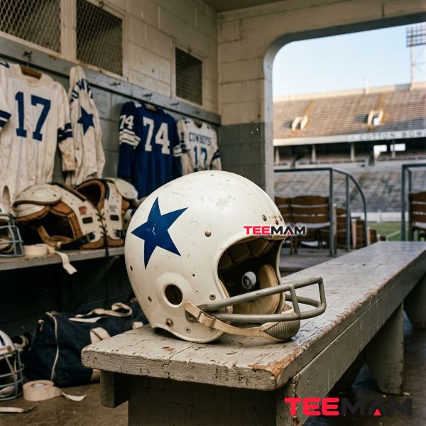
The NFL awarded Dallas its 13th franchise on January 28, 1960, granting the rights to businessman Clint Murchison Jr. and his partner Bedford Wynne. That’s an important date to get right, because it’s often confused with the day the team actually got its name. The new club spent its first few months as the “Dallas Rangers,” and it wasn’t until April 8, 1960, that it was officially renamed the Dallas Cowboys, a switch general manager Tex Schramm pushed for to avoid confusion with a local minor league baseball team of the same name.
Building a visual identity fell to Jack Eskridge, the team’s first equipment manager and one of head coach Tom Landry’s earliest hires, who’d joined the organization in 1959, a full year before Dallas played its first game. The Cowboys themselves credit Eskridge with creating the club’s signature mark: a solid navy-blue, five-pointed star with no border, worn on plain white helmets. Readers curious about how the rest of that first season came together, including the roster the Cowboys had to build almost overnight through an expansion draft, can dig into the full Dallas Cowboys founding story.
The 1964 Redesign That Made the Logo Iconic
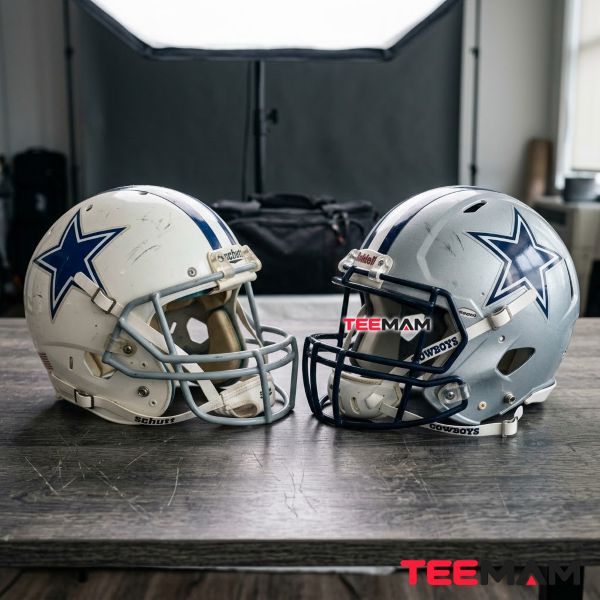
The original plain star defined the Cowboys’ early seasons. The team wore its blue star on white helmets through its first five seasons, and it was during that stretch, in 1964, that Jack Eskridge refined the mark by adding a white border, giving the star a subtle three-dimensional effect. The Cowboys later moved to the silver helmets they still wear today, but the bordered Dallas Cowboys star has remained the foundation of the identity fans recognize now.
| Year | What changed |
|---|---|
| 1960 | Cowboys debut with a solid blue star on white helmets |
| 1964 | Jack Eskridge adds the white border that gives the star a three-dimensional effect |
| Later 1960s | The helmet moves from white to silver; the bordered star carries over unchanged |
| Today | The core star remains the franchise’s defining visual mark |
Why the Border Actually Works
The white-and-navy outline isn’t just decoration. A solid blue star can flatten into a dark helmet shell under stadium lights or on a television broadcast, especially once the Cowboys moved to their now-familiar silver helmets. The border creates contrast against both light and dark backgrounds, which is a big reason the bordered Dallas Cowboys star reproduces cleanly on everything from a metallic helmet to a cotton hoodie without ever needing a full redesign.
The Meaning Behind Silver, Navy, and White
Most logo breakdowns stop at a color chart. The better question is why silver, navy, and white keep working together decades later. Silver plays off the modern, metallic feel of the helmet. Navy adds weight and contrast so the star doesn’t disappear into lighter backgrounds. White keeps the edges crisp, which is what lets the star read as one clean shape instead of a blur, whether it’s stitched onto a jersey or printed on a cap.
America’s Team: How the Star Became Bigger Than Football
The Cowboys became known as “America’s Team” through NFL Films’ 1978 season highlight film, which used the phrase in its narration and made it part of the franchise’s identity alongside the star itself. That reputation grew alongside a run of Hall of Fame talent that wore the mark, from Roger Staubach and Troy Aikman under center to Emmitt Smith in the backfield, all playing under a logo that hadn’t changed while the roster around it did. The team’s headquarters, The Star in Frisco, even borrows the name directly. Fans who want the fuller arc of how that identity built up over six decades, from the Landry era through the Jerry Jones years, can find it in this Dallas Cowboys history guide.
From the Helmet to the Closet: Why the Star Works on Apparel

Over the decades, the star moved beyond the helmet and became part of everyday Cowboys fan culture, showing up on tailgate flags, vintage Cowboys gear, and streetwear that has nothing to do with game day. That crossover isn’t an accident of popularity alone. From an apparel-production standpoint, the star’s biggest advantage is how well it survives being shrunk down or blown up. Complex logos with fine linework or color gradients tend to blur or muddy when they’re embroidered onto a cap or screen-printed onto a heavy cotton hoodie. A five-pointed star with a strong, high-contrast border doesn’t have that problem, and that adaptability is one reason the Dallas Cowboys star works so well across screen printing, embroidery, and patches, not just on a helmet.
At TeeMam, we see that kind of minimalist logo design as one of the reasons sports-inspired apparel holds up over time instead of feeling dated a season later. That same design logic also explains why the star translates so naturally to modern fan wear, from tees and hoodies to caps, and readers can see it in this collection of Dallas Cowboys apparel designs.
The Star and the Numbers Beneath It
The star tells you which franchise you’re looking at; the number on the back tells you which player or era you’re seeing, and in Dallas, some of those numbers carry almost as much weight as the logo itself. Fans digging into which numbers matter most in franchise history can check out this Dallas Cowboys jersey numbers guide.
Why the Logo Has Lasted This Long
The star’s staying power comes down to a fairly simple idea: it doesn’t ask much of the viewer. The Dallas Cowboys star is instantly recognizable even at a distance or at thumbnail size, the design hasn’t chased passing trends the way plenty of NFL logo design did in the 1990s and 2000s, and it works just as naturally on a cap or hoodie as it does on a helmet. None of that happened by accident, but across generations of fans, it hasn’t required constant reinvention either.
Questions Fans Still Ask About the Cowboys Star
When was the Cowboys star logo first introduced? The Cowboys introduced the solid blue star on white helmets in 1960, their inaugural season. Jack Eskridge later added the white border that created the three-dimensional effect associated with the familiar logo today.
Who designed the Dallas Cowboys star logo? The Cowboys credit Jack Eskridge, the team’s first equipment manager and one of Tom Landry’s earliest hires, with creating the star and later adding the border that gave it a three-dimensional effect.
Why does the Cowboys star have a blue and white outline? The outline solved a visibility problem. A solid blue star can blend into a dark helmet, so the added border creates contrast that keeps the Dallas Cowboys star sharp under stadium lights and on TV.
What does the star on the Cowboys helmet represent? It connects the franchise to Texas’s identity as the Lone Star State while giving the team a simple, easily recognized mark of its own.
Has the Dallas Cowboys star logo changed much over time? Only in small ways. The path runs from the plain 1960 star, to the bordered version introduced around 1964, to minor outline refinements later in the decade, with the core shape untouched since.
The Enduring Meaning of the Cowboys Star
After more than six decades, the meaning of the Dallas Cowboys star is surprisingly consistent: a nod to Texas identity, a franchise history that started in 1960 and only meaningfully changed its logo once, a 1960s redesign that solved a real visibility problem, and a symbol that fans have carried well past the stadium gates. Its treatment has evolved, but its core silhouette hasn’t, and that restraint is a big part of why it’s still on helmets, caps, and hoodies across generations of Cowboys fans.
Sources
- Cowboys’ First Equip. Manager, Creator of Star Passes Away — Dallas Cowboys official site
- Historic Flags of the Texas State Library and Archives: Lone Star Flag — Texas State Library and Archives Commission
- Survey Says Packers, Not Cowboys, Now “America’s Team” — NFL.com

Hi, I’m Olivia Bennett, a fashion and lifestyle writer at TeeMam with 6 years of experience creating content about fashion, outfits, and lifestyle trends. I enjoy sharing practical style ideas for everyday wear, game days, holidays, and special occasions, helping readers find looks that feel comfortable, fun, and uniquely their own.